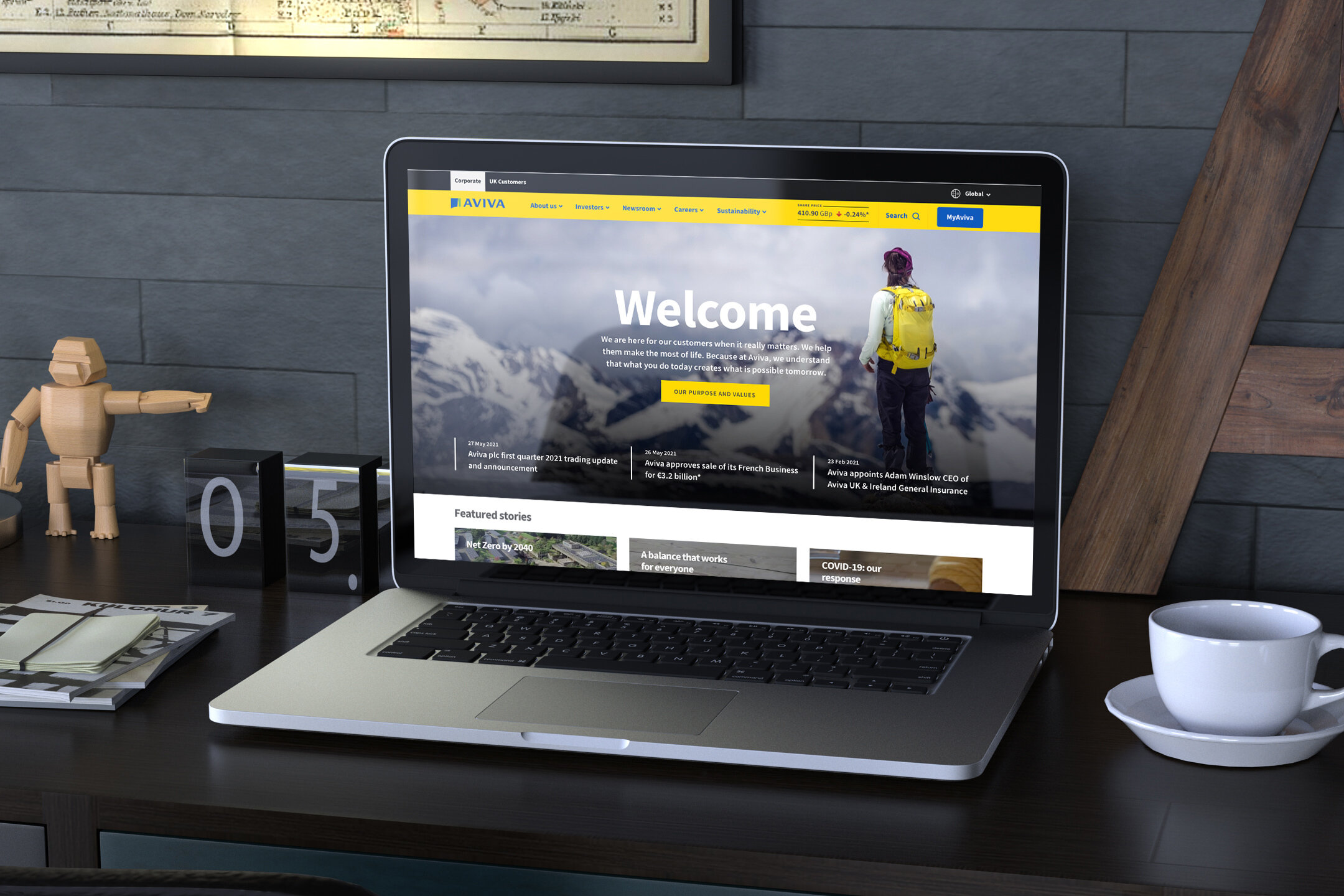
Aviva.com
How do you give a corporate site its own identity in order to be a destination to engage potential investors and existing shareholders alike?
Delivering on a purpose
Aviva is a leading general insurer and life and pensions, provider. It has established brand recognition with its consumer customer base but arguably less so with its corporate investor and shareholder audience.
This had to change for the business strategy to resonate with all.
Greater focus was needed in order to better represent the corporate side of Aviva. Its current and future financial strength, investment opportunities and future sustainability targets.
Ultimately, the corporate face of Aviva needed a differentiated and redefined digital experience.
A misguided offer
Aviva.com had become a dumping ground for business updates, report and results news and other high churn content. Whilst this offered a snapshot on shares performance and company activity it lived short in the memory.
What was needed was a reshaped digital offering that would compliment the company purpose which is to be with you today, for a better tomorrow. A new voice was needed and one that would captivate users, increase brand advocacy and drive trust.
Tuning into users needs
From shareholders through to journalists, Aviva.com has a varied audience, each with its own unique wants and needs. Understanding what each user visited the site for and how well the site catered for these needs was key to moving forward and shaping the purpose of the site.
User research was gathered through a series of moderated depth interviews and task-based observations.
Below is a snapshot of the feedback from the user interviews:
Overwhelming and cluttered
“Feels like a mishmash of information and headlines that have been put together”.
Repetitive content
“I’m underwhelmed by the site, there seems to be quite a bit of text, and mixed content types”.
Confusing navigation
“The mega menu has lots of duplicate links and it’s not clear where to find landing pages”.
Poor search and tagging
“The search function can be a bit hit and miss, it was quite slow and said no results while loading”.
Low discoverability
“The content is confusing. It doesn’t feel very curated or easy for the reader to use”.
Suboptimal site performance
“I instantly felt confused as the mega menu didn’t load and the tools were slow”.
Key user needs and wants
To start improving the Aviva.com experience, the user research was distilled into key customer objectives to tackle and prioritise. This allowed us to plan out our approach to improving the experience and identify with stakeholders the business value per design solution.
Here are the thematic areas of improvement we uncovered:
Lead with an editorial edge, opinion and thought leadership
Users want to learn more about Aviva.com and understand what makes the corporate side of the business tick.
Uplift the customer experience through UI design
One consistent observation that users commented on was the lack of hierarchy and variation to the UI within the site.
Focus on streamlining the site information architecture
Multiple links to the same content and a dense mega menu contributed to a lack of self orientation by users.
Improve the page performance and load speed
Several users had their browsing experience hampered by slow web performance. Most notably the loading of certain tools.
Address significant accessibility flaws within the navigation
On several occasions, users were seen to struggle with the mega menu pattern and misunderstand the functionality.
Deliver more information for shareholders
Most shareholder users wanted clear routes to dividend information and have the ability to view live and historical data.
Introduce a content tagging strategy to enable searchability
Users attempted to click on H5 labels to view related content and expressed the desire to have focussed views of subjects.
Establish clarity between commercial and corporate sites
It was witnessed that several users became disorientated by links that traversed across the Aviva digital estate.
Turning objectives into solutions
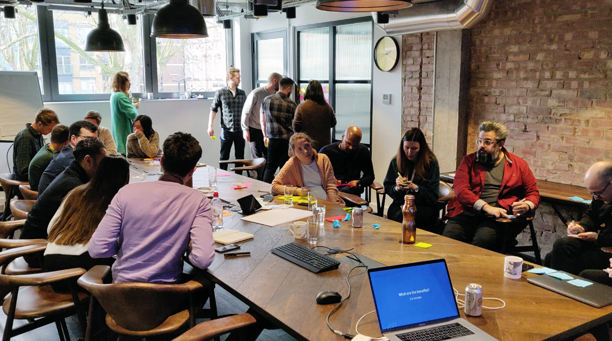
Armed with user insight and stakeholder agreed objectives, we set our attention on the ideation phase to explore potential design solutions. Utilising a Design Sprint methodology ensured we not only worked smart and fast but also kept a user-centred focus on our decision-making process.
As we developed and refined ideas, we aligned key decisions not only against the identified customer needs but also the company purpose and strategy to build solid foundations for the future.
Design execution
An array of ideas and design solutions were progressed and narrowed down into a list of enhancements to apply to Aviva.com. Each would create greater standout and give the site more levers to pull when engaging its audience.
Below is an overview of the shortlisted design solutions created during the design sprint.
• Enhanced editorial templates and components
• New feature content templates
• New tagging strategy
• Redesigned IA and sitemap
• Refreshed landing page content
• Accessibility enhancements to the navigation
• Repurposed sharable content
Greater stimulation through enhanced editorial content
The newly created long-form article template and components provided much more variation and stimulus to users looking for thought leadership and opinion from Aviva.com.
The new components were designed to be configured in many ways in order to provide maximum re-use and support all content types, be it copy dense or media-heavy.
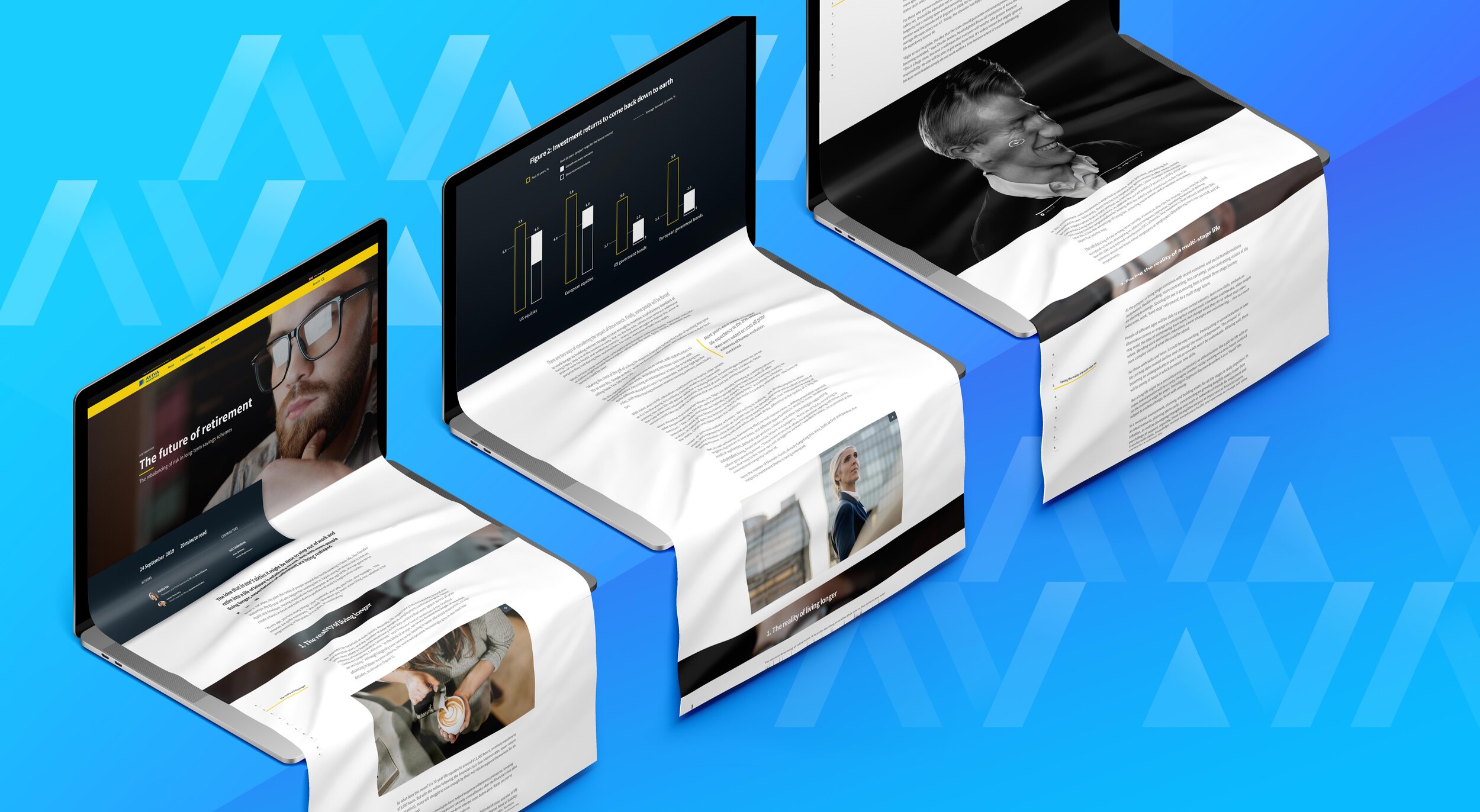

New author component provides users with contextual information such as reading length, authors, contributors and date published, up front and sits in partnership with the page hero image and introduction copy encouraging user discoverability.
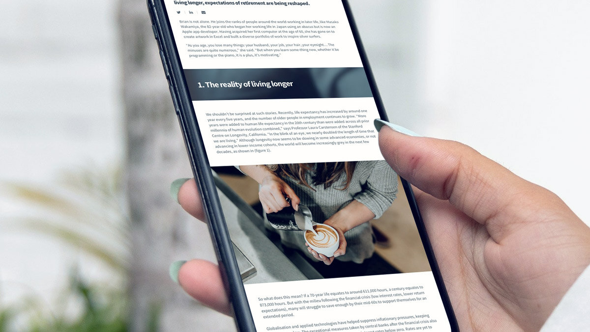
Dynamic chapter component aiding scan reading and orientation. The image crop is automatically taken from the hero component to keep continuity within the page.
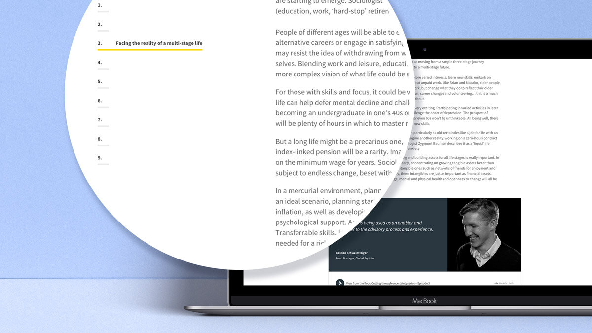
Sticky side navigation for quick linking to content within the page to save scroll fatigue with users.
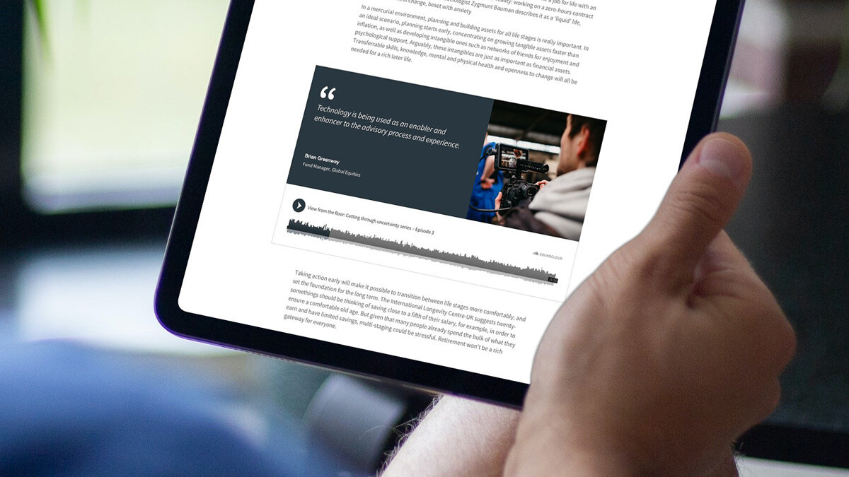
To support the engagement from users with editorial content, a new audio component was created allowing for in page audio files to be played to support the user comprehension of certain subjects or opinions.
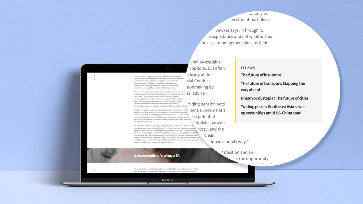
See also component providing cross pollination of content, allowing users to dive deeper into subjects at their leisure.
Allowing users to self-serve and find exactly what they want
Following on from a card sort and tree test, the site IA and sitemap was rewritten to harmonise with how users viewed the content and where to find it.
This provided an opportunity to streamline the volume of links within the mega navigation which had been a particular source of user confusion and a point of failure. This also led to several improvements to the accessibility of the site navigation including removing duplicated links, rewriting metadata, enhancing keyboard functionality and applying refined logic for screen reader users.
Cross-pollination of site content
A tagging strategy was created to truly position aviva.com as a definitive source of information for shareholders, investors, analysts, journalists and job seekers.
The use of tagged content would allow users to pinpoint areas of focus much quicker without the need of searching heavily. Topic-based content can be viewed singularly or as a curated collection leading users to browse for longer, increasing their brand recognition and desire to share with others.

The newsroom is the daily heartbeat of aviva.com therefore tagged content can now be sorted via in page filters allowing users to pinpoint a category or topic quickly without confusion.
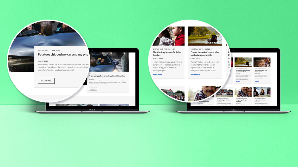
Topic based tagging allowing users to collate and view an area of interest simply.
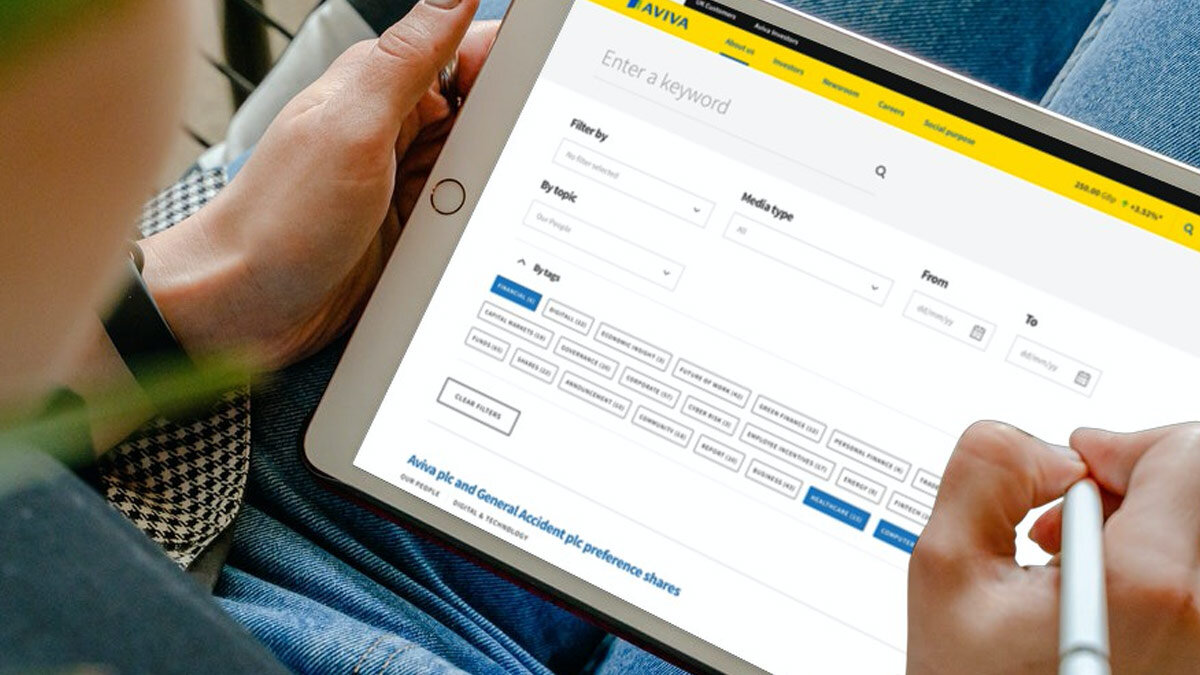
Content tags working with the search functionality to allow users to view the number of returns per category or topic.
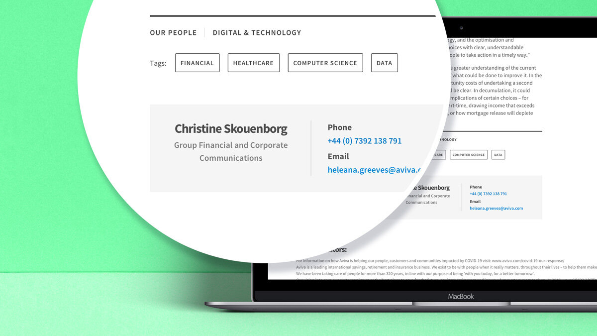
Multiple tags can be used to micro-categorise and denote several areas of interest per content.
Variety and more variety
To provide a varied and stimulating experience for users, new ‘feature’ and ‘feature lite’ templates were created. This gave the content a defined purpose, removed the monotone feel to pages and enhanced page hierarchy.
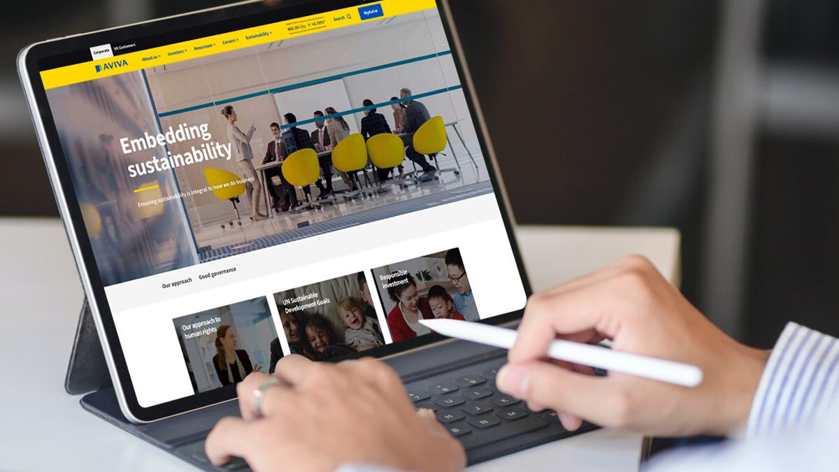
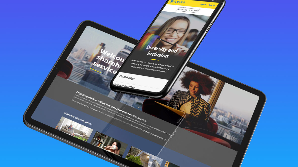
We also took the opportunity to redefine each of the landing pages that deliver the entry point to the main sections of the site. This allowed for a refocus on guiding users to areas of interest, key assets or information and jump off points to lower-level content.

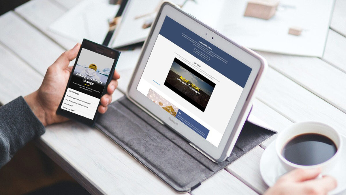
The impact and results
1.5 million
site visits
Per year, with an average session time of 4 minutes
12,000
Peak daily site visits
5,000 average daily site visits
7% rise in
Net Promoter Score
These users would recommend Aviva.com to clients or colleagues.
21% increase
in mobile use
Average page loading speed down to 1.9s


